Presentation Slides
Slides can add great value to an oral presentation. Like all visual aids, though, slides should enhance your presentation, not carry it. Never give a presentation with slides unless you’re prepared to give the presentation without them. At no time should the visuals overshadow you as the speaker.
Starting Out
Begin by selecting a topic that fits the assignment. Make sure it’s expansive enough to fill the time allotted but not so vast that you can’t cover it sufficiently.
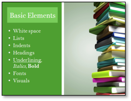 Next, brainstorm. Write down anything and everything that comes to mind about your topic. Think of as many ideas as possible, so you can choose the best ones. Build on what you already know about the topic and don’t dismiss any ideas, even those that seem far-fetched. Ask others for input to broaden your view of the topic.
Finally, consider your audience. Your audience will determine the level of formality of your presentation. If you’re giving a specialized speech, define any terms the audience may not know. Pinpoint areas in your speech where the audience may disagree with you and strengthen your argument in those sections.
Organizing
Write a thesis for your presentation just as you would for a paper. Then, make a list of your key points and order them from weakest to strongest. Your introduction should grab your audience’s interest. Try using a strong photo on your title slide. While the slide is up, you can introduce your topic, present your thesis, and give your audience an overview or a sense of the presentation’s direction.
The conclusion should, likewise, end on a strong note—don’t simply summarize. Think of an example or idea that will stay with the audience and back it up with a strong or memorable image.
Editing
 Once you have framed the basic presentation, cut the text on the slides to a bare minimum—use only what is necessary to enhance or illustrate your spoken words. Slides are like billboards: people look at them only for a second before they shift their attention elsewhere. Placing an entire paragraph on a slide will misfire, as your audience will either try too hard to read it and miss what you’re saying or read it before you finish speaking, making what you say irrelevant. In PowerPoint, “ctrl B” will blacken the screen, a good trick if you want to turn the audience’s attention away from the visual for a short time.
In addition to ensuring the content on your slides is short and concise, your presentation as a whole should be condensed to keep the audience’s attention. If a lengthy presentation is necessary, make sure it’s dynamic enough to keep your listeners focused. Rehearse your presentation ahead of time so you know how long it will be, leaving time for questions or comments from the audience.
Slides, like anything else written, need proofreading. You don’t want to embarrass yourself on presentation day with a “their” instead of a “there,” in large print for everyone to see on the screen.
Writing Text
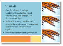 Be sure to use a legible font size for your slide text. If you keep the text to a minimum, as you should, making the font large enough to be read shouldn’t be a problem. If you’re using Microsoft PowerPoint, go to slide sorter view and adjust the zoom to 66%. If you can read the slides in that view, your audience should be able to read them as well.
Bulleted lists can be useful for slides, but don’t overdo them. Limit yourself to one level of sub-bullets; anything more than that gets messy and hard to read. Make sure bulleted items are consistent in terms of capitalization and punctuation. (Either they all end with a period, or they all end with nothing, etc.) If your slide looks too crowded, find something to delete.
Don’t get carried away with the animation or transitions features. Minimal animation can add a nice touch to your presentation, but too many special effects look cheesy. Use attention-grabbing animation only where you need to add emphasis and stick with classic options such as “fade in” as opposed to “spiral in.” Animations should be fast—you don’t want your audience to get impatient waiting for your title to scroll across the screen. Your animation should make sense and look natural according to the layout of your information. (For example, the title should never appear last.) Above all, animation should not hinder the legibility of your slides.
Eye-catching slides can greatly enhance your oral presentation, such as the slide featured in this section. Most presentation programs, like PowerPoint or Keynote, come with premade design options that work well for basic presentations. To customize your visuals, however, you’ll want to learn how to create presentations slides yourself.
Designing Slides
Simplicity is an essential design principle for slides. Slides will be cleaner, sleeker, more professional, and more legible with a simple color palette and consistent shapes. Don’t include too much text on your slides; instead, save that space for striking visuals. Otherwise, your audience will be too busy reading to listen to you.
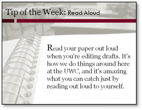
Color schemes present unlimited possibilities, but it’s best to start off using premade sets found in presentation programs or online. Muted colors are the safest for professional settings. For example, the University Writing Center most often uses maroon, black, grey and white. However, splashes of bright colors are acceptable if used judiciously. You may also use color if it fits with a theme. Examples of thematic colors include company approved colors, brand colors, or a color associated with your subject, such as green for ecological topics.
Composition of slides—or the layout of information—can also help make your slides more effective. If your audience members are accustomed to reading text from top to bottom and left to right as we do in English, then the elements in your slide should lead the viewers’ eyes in those directions. Avoid “unnatural” placement such as a title in the bottom, right-hand corner.
Margins matter, even on presentation slides. Don’t squish information onto a slide by moving it to the edge of the screen—it looks messy and unprofessional. You should also leave empty space between objects (i.e., a text box and an image). If you use a premade layout provided by your slide program, this shouldn’t be a problem. If you design your own layout, consider using gridlines as you work to keep objects aligned and separated.
Adding to Your Slides
The slide in the example on the left uses art and bright colors; it manages to be conservative and professional by remaining simple and clean. Make sure any art you use clearly connects to your content. For example, don’t use a picture of a stage when you’re talking about the stages of a process; the connection between the ideas is simply too tenuous. Good quality photographs will take your presentation to a higher level of professionalism. Stock photo websites, such as Morguefile.com or Texas A&M’s Marketing and Communications stock photography website, photo.tamu.edu, offer many free, high quality 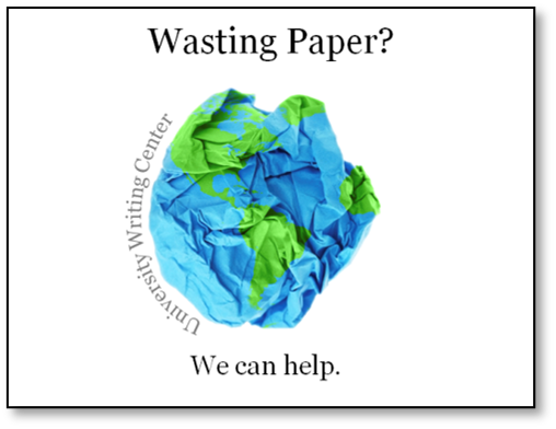 photographs. Use photos that are simple and of the highest resolution possible. Clip art drawings should be used with discretion because they often look unprofessional. Use your own graphics and photographs wherever possible to make your presentation unique. To create clean, colorful diagrams, consider using a tool such as Microsoft’s SmartArt.
Unless you’re using your own photos or stock images, provide a citation to indicates the source of the material. Don’t just use a search engine and copy an image you like without citing the source.
If you enlarge a photo (or any picture), view the slide show to make sure the image is not pixelated (fuzzy) due to your expansion. If you decide to use drawings, all of the images should be in the same color scheme and the same style. (Try the Format > Recolor option if they aren’t originally the same color.) Many clip art images can be modified by selecting, right clicking, and “ungrouping.” This allows the user to delete, move, or recolor specific shapes in the image.
Photos can be used as slide backgrounds to capture attention; however, on photo background slides, use minimal text and make sure the font color is readable. Also, make sure the photo you’ve chosen isn’t too busy and that it doesn’t distract from your information. Be careful when using the “select transparent color” tool to remove a background on an image because the tool will remove all of that particular color in the image. Only use the tool if the background is one pure color (white); otherwise, you’ll be left with a pixelated mess. Avoid placing a picture with a white background onto a slide with a dark background.
 Typography is the art and technique of working with type. If your artistic skills are lacking, you can use carefully selected typography to enhance your presentation instead of (or in addition to) artwork. Experimenting with typography doesn’t mean changing the font on every slide, however. Your presentation should typically have no more than three fonts. Stay away from unprofessional, “cutesy,” decorative, or hard to read fonts such as Chiller, Ravie, or Curlz Mt. At the University Writing Center, we use punctuation as a visual element in many of our presentations. It’s relevant to our topic (writing) and gives our slides a striking visual, without using photos or clipart that might be more distracting.
Strive to be “conservatively liberal” in your designs. In other words, select graphics and colors conservatively, but think of new, inventive ways to use them. Your designs can be interesting and distinctive and still look professional.
Finally, remember that a strong stage presence will take your presentation much further than good slides. When you’re presenting, make sure you have energy and “give a speech.” DON’T read from your slides. Stand up straight, move, gesture for emphasis, and maintain eye contact with your audience. If you are actively engaged in your presentation, your audience will be as well.
References
Duarté, Nancy. Slideology: The Art and Science of Creating Great Presentations. Sebastopol: O’Reilly. 2008.Faigley, Lester. Writing: A Guide for College and Beyond. New York: Pearson-Longman. 2007.